| Thank goodness…no. But there are some interesting changes in the electorate from the Kerry-Bush race to McCain-Obama. |
| |
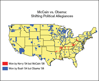
| The map at right shows counties that were won by John Kerry in 2004, but were carried by John McCain in 2008. Also shown are counties that switched horses the other way…won by George Bush in 2004, but Barack Obama in 2008. Visually, it’s pretty easy to see who was the net winner in this fruit-basket turnover. McCain picked up support in a small number of rural counties while Obama gained in a very large number of counties, many of which are in or adjacent to large metro areas. |
| |
| Population in the Kerry-to-McCain switchers is about 1.4 million, dwarfed by the Bush-to-Obama counties with nearly 47 million people. |
| |
| But there are also measurable differences in the demographics of these two groups. The counties that switched to Obama from Bush have a much higher minority population, and skew younger, neither of which are a surprise. Educational attainment levels are higher than the Kerry-to-McCain counties, and the Teamsters union accounts for a far larger share of all union certification elections in the counties won by Obama. |
| |
|
|
 |
| [Place cursor over map to enlarge] |
|